
Where front components can be used
Front components can render in four locations within Twenty:- Side panel — Non-headless front components open in the right-hand side panel. This is the default behavior when a front component is triggered from the command menu.
- Widgets (dashboards and record pages) — Front components can be embedded as widgets inside page layouts. When configuring a dashboard or a record page layout, users can add a front component widget.
- App settings — Defined with
defineSettingsFrontComponent(), the front component is the whole content of the app’s Settings tab, in place of the default Variables tab. - AI chat — A logic function exposed as an AI tool can name a front component, which then renders that tool’s calls inline in the chat in place of the default step row.
- Pair it with a command menu item — registers it in the command menu (Cmd+K) and, optionally, as a pinned quick-action.
- Embed it as a widget in a page layout — places it on a record’s detail page or dashboard.
- Define it with
defineSettingsFrontComponent()— makes it the whole content of the app’s Settings tab, in place of the default Variables tab. - Name it from a logic function’s
toolTriggerSettings— renders the tool’s calls in the AI chat.
Basic example
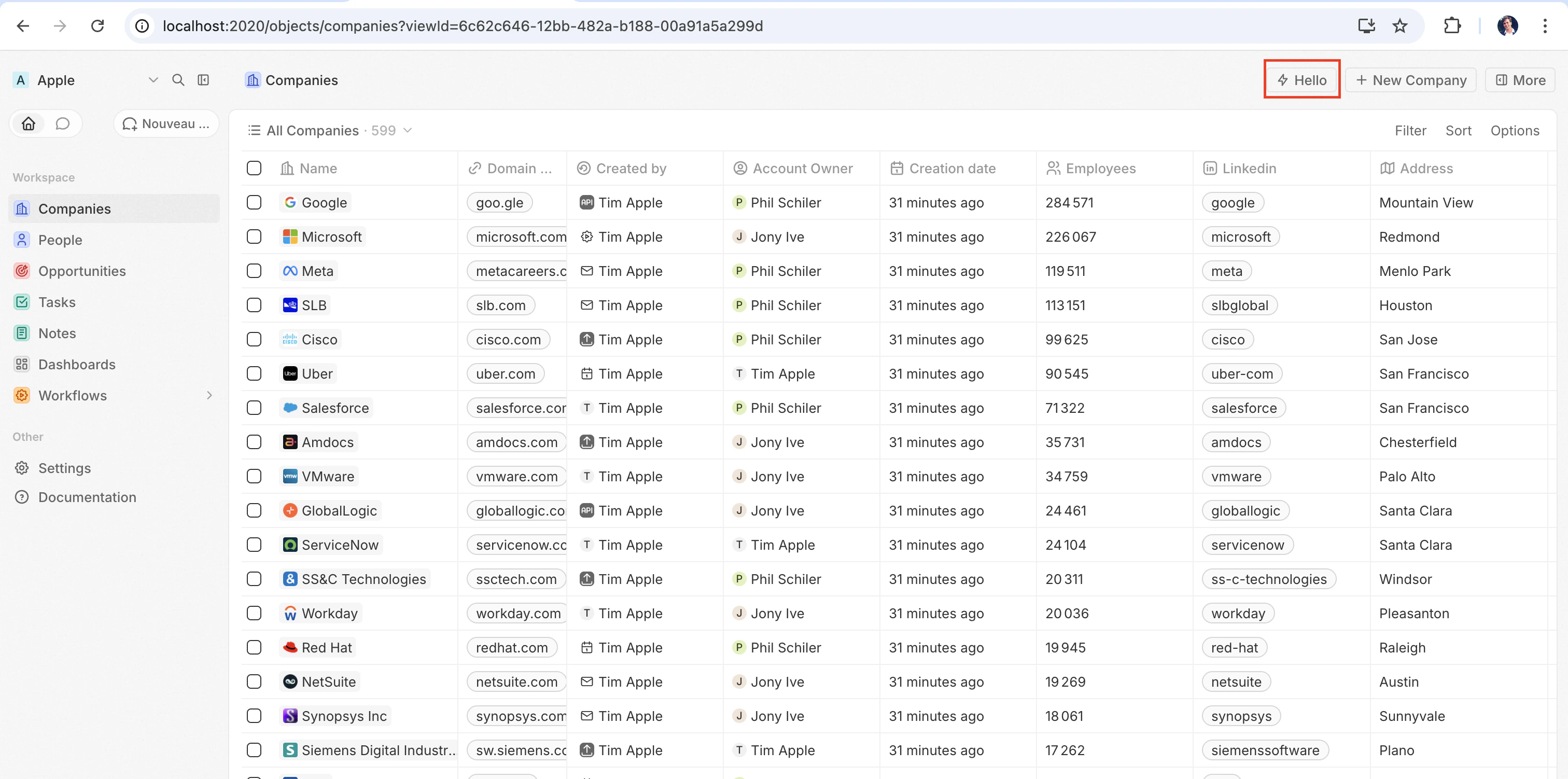
The quickest way to see a front component in action is to pair it with adefineCommandMenuItem, so it appears as a quick-action button in the top-right corner of the page:
src/front-components/hello-world.tsx
src/command-menu-items/hello-world.command-menu-item.ts
yarn twenty dev (or running a one-shot yarn twenty apply), the quick action appears in the top-right corner of the page:
Configuration fields
Placing a front component on a page
Beyond commands, you can embed a front component directly into a record page by adding it as a widget in a page layout. See Page Layouts for details.Custom settings component
To replace the auto-generated variable configuration UI with your own component, define it withdefineSettingsFrontComponent instead of defineFrontComponent. It takes the same configuration fields (except isHeadless, which is not accepted since a settings component always renders visible UI) and additionally marks the component as the app’s settings UI.
The component is the whole content of a dedicated Settings tab, and it replaces the auto-generated Variables tab: your app is expected to render its own variables. Twenty’s system-managed sections — auto-upgrade, App URL, and connections — live in the app’s General tab and cannot be overridden by the app. App URL only shows with Advanced mode on.
src/front-components/app-settings.tsx
Headless vs non-headless
Front components come in two rendering modes controlled by theisHeadless option:
Non-headless (default) — The component renders a visible UI. When triggered from the command menu it opens in the side panel. This is the default behavior when isHeadless is false or omitted.
Headless (isHeadless: true) — The component mounts invisibly in the background. It does not open the side panel. Headless components are designed for actions that execute logic and then unmount themselves — for example, running an async task, navigating to a page, or showing a confirmation modal. They pair naturally with the SDK Command components described below.
src/front-components/sync-tracker.tsx
null, Twenty skips rendering a container for it — no empty space appears in the layout. The component still has access to all hooks and the host communication API.
SDK Command components
Thetwenty-sdk package provides four Command helper components designed for headless front components. Each component executes an action on mount, handles errors by showing a snackbar notification, and automatically unmounts the front component when done.
Import them from twenty-sdk/front-component:
Command— Runs an async callback via theexecuteprop.CommandLink— Navigates to an app path. Props:to,params,queryParams,options.CommandModal— Opens a confirmation modal. If the user confirms, executes theexecutecallback. Props:title,subtitle,execute,confirmButtonText,confirmButtonAccent.CommandOpenSidePanelPage— Opens content in the side panel. Routed pages use the same typedto,params, andqueryParamsprops asCommandLink, plus optionalhash,pageTitle, andresetNavigationStackprops. The workspace route registry decides whether the requestedAppPathsupports the side panel.pageTitleoverrides the panel header title, whileresetNavigationStackclears earlier panel pages before opening the route. Purpose-built panel tools use their own page-specific props.
Command to run an action from the command menu:
src/front-components/run-action.tsx
src/command-menu-items/run-action.command-menu-item.ts
CommandModal to ask for confirmation before executing:
src/front-components/delete-draft.tsx
CommandOpenSidePanelPage to open the current record in the side panel on a specific tab. hash is a page layout tab id without the leading # (default layouts use ids like company-tab-emails or company-tab-timeline; custom layouts use the tab’s own id). If the id doesn’t exist in the record’s layout, the default tab opens instead:
src/front-components/open-company-emails.tsx
Calling a logic function
Front components run browser-side in a Web Worker sandboxed inside an opaque-origin iframe, while logic functions run server-side. There is no direct in-process call between the two — instead, a front component reaches a logic function over HTTP. A logic function declared withhttpRouteTriggerSettings is reachable over HTTP at its route path. RestApiClient treats paths starting with /s/ as app routes, resolves them to the URL your functions are served from, and authenticates them with TWENTY_APP_ACCESS_TOKEN.
On Twenty Cloud, HTTP-triggered logic functions are served on a dedicated per-workspace domain at https://<your-workspace-subdomain>.withtwenty.com<path>. For external callers, copy the exact URL from the function’s HTTP trigger settings or the application’s Settings tab.
A headless front component can run the call on mount via the Command component, then unmount automatically:
src/front-components/sync-prs.tsx
RestApiClient is the logic function’s httpRouteTriggerSettings.path, prefixed with /s. Keep isAuthRequired: true; the TWENTY_APP_ACCESS_TOKEN Twenty mints for your component authenticates the request:
src/logic-functions/fetch-prs.logic-function.ts
TWENTY_APP_ACCESS_TOKEN is injected automatically — see Application variables. Because secret application variables are never exposed to front components, keep API keys and other sensitive logic in the logic function, not in the front component.Calling the Twenty REST API
To call app HTTP routes or read and write Twenty records from a front component, useRestApiClient from twenty-client-sdk/rest. It sends /s/... paths to your workspace’s functions base URL and every other path, including /rest/..., to TWENTY_API_URL.
It always acts as the person looking at the page. runAs: 'application' is a logic-function option only: a component never receives your application’s own token, so asking for it here throws. Put work that needs the app’s own access behind a logic function and call that instead.
options accepts headers, query (a record of query-string params; nullish values are skipped), and an AbortSignal via signal. A non-FormData object body is JSON-serialized automatically. On a 401, the client refreshes the access token once through the host and retries the request.
The base URL and token are resolved from the environment by default. Pass overrides to the constructor when needed — for example in tests:
RestApiClientError exposing status, statusText, url, and the parsed body:
Accessing runtime context
Inside your component, use SDK hooks to access the current user, record, and component instance:src/front-components/record-info.tsx
Application variables
Application variables defined indefineApplication() with isSecret: false are available inside front components via the getApplicationVariable utility:
src/front-components/greeting.tsx
getApplicationVariable always returns a string (or undefined), regardless of the variable’s declared type. The string is serialized consistently by type (booleans as "true" / "false", numbers as decimal strings, arrays / objects as JSON), the same format used for logic-function process.env — parse it yourself (Number(...), JSON.parse(...), === 'true'). See Variable types.
Reading and updating variables at runtime
getApplicationVariable returns the values injected when the component loaded, so a value written afterwards only shows up on the next load. To read the stored values, or to write one (what a custom settings component does when it saves what the user typed), go through MetadataApiClient:
src/front-components/app-settings.tsx
- Your component’s token is bound to your own application.
updateOneApplicationVariabletargets it, soapplicationIdis optional and naming another application is refused. Reading theapplicationVariablesof another application is refused the same way, and an application belonging to another workspace reads as not found. - The key must be one your app declares in
defineApplication(). Writing a key that is not declared is a not found. - Secret variables read back masked, never as the stored value. Writing them works normally.
- Reading a variable’s
value, and writing it, need theAPPLICATIONSsettings permission on both your app’s role and the signed-in person’s role, since the component’s token is the intersection of the two. AddSystemPermissionFlag.APPLICATIONStopermissionFlagUniversalIdentifiersin your application role.
System variables
The following system variables are always available viaprocess.env:
TWENTY_FUNCTIONS_URL
Twenty also injects TWENTY_FUNCTIONS_URL into front components and logic functions: the base URL your app’s HTTP-triggered logic functions are served from.
It exists because that URL is not always the Twenty server itself. On Twenty Cloud, app routes are served on a dedicated per-workspace domain (https://<your-workspace-subdomain>.withtwenty.com, or the application’s primary public domain when one is configured) so that app-authored responses run on an isolated origin rather than on the Twenty app origin. Self-hosted and local instances serve app routes under the /s prefix on the server itself and may not set the variable at all. Since the base URL varies per workspace and per instance, your code cannot hard-code it — the server injects the right value at runtime.
You rarely need to read it directly. Call your routes through RestApiClient with a /s/-prefixed path and the client resolves the URL for you: it strips the /s prefix and targets TWENTY_FUNCTIONS_URL, falling back to <TWENTY_API_URL>/s when the variable is not set. Use resolveUrl('/s/<path>') to get the absolute URL without sending a request, e.g. for a link. Read the variable directly only when building a URL by hand:
Host communication API
Front components can trigger navigation, modals, and notifications using functions fromtwenty-sdk:
Here is an example that uses the host API to show a snackbar and close the side panel after an action completes:
src/front-components/archive-record.tsx
Storage
localStorage and sessionStorage work as they do in a normal page, with the standard synchronous API. Your keys are scoped to your app install and the signed-in user: no other app can read them, and another user signing into the same browser starts from an empty store. Values written to localStorage stay on the device across reloads; sessionStorage lasts for the browser session.
src/front-components/note-draft.tsx
QuotaExceededError, like the browser API.
Working with multiple records
UseuseSelectedRecordIds() to handle multiple selected records. This is useful for bulk operations:
src/front-components/bulk-export.tsx
src/command-menu-items/bulk-export.command-menu-item.ts
Public assets
Front components can access files from the app’spublic/ directory using getPublicAssetUrl:
Sharing dependencies across front components
By default, every front component bundles its own copy of the libraries it imports, so an app with five components ships React five times. Declare shared dependencies in your app’spackage.json to build those libraries once and have every component of the app load them from a single cached file:
package.json
src/front-components/counter.tsx
- One shared dependencies bundle per app. The bundle is built from your app’s own dependencies, so you keep full control of the versions you ship.
- List the exact specifiers you import.
twenty-ui/primitives/inputandtwenty-ui/primitives/data-displayare two entries; a package name alone does not cover its subpaths. Listingreactautomatically coversreact/jsx-runtime. - Share
react-dom/clientalongsidereact. Every component renders throughcreateRoot, so leaving it out means each component still bundles React DOM. - The bundle is cached. It is served under a content-hash URL with a long-lived immutable cache, so it is downloaded once and reused across all components of the app until one of its dependencies changes.
- Components that import none of the shared packages never download it.
Styling
Front components support multiple styling approaches. You can use:- Inline styles —
style={{ color: 'red' }} - Twenty UI components — Twenty’s own component library; see Using Twenty UI components below
- Emotion — CSS-in-JS with
@emotion/react - Styled-components —
styled.divpatterns - Tailwind CSS — utility classes
- Any CSS-in-JS library compatible with React
Using Twenty UI components
Twenty ships its component library as thetwenty-ui package. Front components can use it for buttons, tags, status pills, chips, avatars, icons, typography, and theme tokens that automatically match the workspace’s light and dark theme.
Installation
twenty-ui is published alongside the SDK packages with the same version. Add it to your app, pinned to the version of twenty-sdk and twenty-client-sdk you use:
twenty-ui is bundled into your front component at build time, so it only needs to be a dependency of your app — there is nothing to configure at runtime.
Importing components
Import from the matching subpath rather than the package root, so only the components you use end up in your bundle: Foundational controls are grouped undertwenty-ui/primitives/<family>.
Shared design presets and app building blocks are available from twenty-ui/components.
These entry points do not require monaco-editor.
Icons
Import individual icons fromtwenty-ui/icon:
IconsProvider, useIcons, and iconsState — they pull in the full Tabler icon set (several MB).
Theming and theme tokens
Twenty UI components automatically match the workspace’s light and dark theme — the renderer applies the active color scheme on the host, and the components resolve their colors against it. To use the same design tokens in your own inline styles, call theuseTheme() hook. It returns Twenty’s theme tokens (spacing, colors, radii, fonts) wired to the active theme, with no ThemeProvider setup needed in your component:
useTheme() is a hook, you read tokens inside the component body, so the values always reflect the live theme. The same token map is also exported as the themeCssVariables constant, but prefer useTheme() in front components — a module-level constant that dereferences themeCssVariables can be undefined while the app manifest is extracted.
To branch on the active scheme explicitly, read it with useColorScheme() from twenty-sdk/front-component, which returns 'light' or 'dark'.
Current limitations
Front components are under active development. Rendering, styling, handling events, measuring elements and browser storage work well. Anything that reaches past those (calling a DOM method on a ref, observing element resizes, portaling outside your tree) is missing or incomplete today, and most of it fails silently: no exception, and no TypeScript error either, since the scaffold is typed against the full browser DOM. If one of these blocks you, open an issue so it gets prioritized.Layout and measurement
Elements can measure themselves: the host mirrors geometry into the sandbox, so reads are answered locally but can be up to one frame stale, and the first read of a never-measured element returns zeros. After writing, re-read in arequestAnimationFrame callback or an effect.
Positioning from
getBoundingClientRect now works, but anything watching size changes through ResizeObserver (recharts ResponsiveContainer, Floating UI’s autoUpdate) still does not. Prefer CSS for layout anyway: your stylesheet reaches the real page, so flexbox, grid, aspect-ratio, clamp() and @container behave normally, with no frame lag.
requestAnimationFrame works, with or without the window. prefix. Only Chrome runs a real animation frame inside a worker; Firefox and Safari get a 16 ms timer, so use it to defer a re-read past a write, not to drive an animation.Global scope
The worker’s own natives are also aliased ontowindow, so they work with or without the window. prefix: fetch, setTimeout/clearTimeout, setInterval/clearInterval, queueMicrotask, console, crypto, performance, structuredClone, btoa/atob, URL/URLSearchParams, AbortController/AbortSignal, Headers/Request/Response, Blob, File, FormData and TextEncoder/TextDecoder.
DOM access
Aref gives you a sandbox element, not an HTMLElement.
element.classList works, backed by the class attribute: add, remove, toggle, replace, contains, item, length, value and iteration all behave as they do in a browser, and className stays in sync.
The portal gap is why Radix, Headless UI, MUI and react-select popovers render nothing by default. Most accept a container prop; point it at an element you rendered.
Events
Mouse, pointer, touch, drag, keyboard, focus,input/change/submit, scroll/wheel/contextmenu and animationend/transitionend cross to the host, plus a few per element: load/error on img, clipboard and composition on input/textarea, media on video/audio, toggle on details/dialog. Anything else (onAuxClick, onSelect, onInvalid, onReset, onAnimationStart, pointer capture, onLoad off img) is dropped without warning.
document.addEventListener() and window.addEventListener() register without error and never fire, which is why a drag stops as soon as the pointer leaves the element it started on. event.preventDefault() does not cross either; form submission, dragover/drop and link clicks are already guarded for you.
Attributes and styling
Each element forwards its own properties to the host DOM (href on a, src/alt on img, value/placeholder/disabled on input, and so on), plus a common set on every element: id, className, style, title, tabIndex, role, draggable and any aria-* / data-* attribute (hyphenated, so ariaLabel is dropped). Anything outside that is silently discarded, so express custom state as data-*.
Component CSS, whether from import './styles.css', CSS-in-JS or a style element, is injected into the host page’s head unscoped. So class names collide with Twenty’s own (prefix them, and never write bare div { ... } selectors), and @media matches the browser window rather than your widget (use @container with your own container-type). Inline style props are unaffected.
Storage and network
localStorage and sessionStorage are provided by Twenty rather than the browser: the component runs in a worker at an opaque origin, so the host stores the values on your app’s behalf. See storage for their scoping and limits. IndexedDB, cookies, the Cache API and BroadcastChannel remain unavailable. To persist state across devices, call a logic function and use its key-value store.
fetch works, with caveats:
- Calls to the Twenty API and your app’s routes are proxied by the host, so prefer
RestApiClient. On proxied calls,AbortSignaland the otherRequestInitoptions are dropped, and onlystringandURLSearchParamsbodies are supported. - Other origins leave the sandbox with
Origin: null, so a third-party API answers only if it sendsAccess-Control-Allow-Origin: *. Call it from a logic function instead. fetch('/rest/people')is never matched to the Twenty API, because the sandbox has no page URL to resolve a relative path against.
Media capture
navigator.mediaDevices.getUserMedia() and MediaRecorder work inside front components through sandbox polyfills, so standard recording code runs unchanged and MediaRecorder.isTypeSupported answers for common container/codec combinations. Detailed getUserMedia constraint objects are accepted but not forwarded — the host captures with its defaults for the requested kinds — and only one capture can be live at a time across applications. Store a recorded Blob with the uploadFile host function.
Other gaps
- File contents. An
inputof typefilegives your handler file metadata only, not the bytes, soFileReaderis not available. To upload aBlobyour code already holds — e.g. one produced byMediaRecorder— use theuploadFilehost function. - Drag-and-drop payloads. Drag events fire, but
event.dataTransferisundefined. - Node built-ins.
fs,pathandnode:cryptofail the build, so move that work into a logic function. Web Crypto replacesnode:crypto, andfetch,TextEncoderandURLare available too, see global scope — but nothing replacesfs: the sandbox has no filesystem. iframeis always re-sandboxed withoutallow-same-origin, so an embed relying on its own session renders logged out. It has noonLoadeither.