> ## Documentation Index
> Fetch the complete documentation index at: https://docs.twenty.com/llms.txt
> Use this file to discover all available pages before exploring further.
# Front Components
> Build React components that render inside Twenty's UI with sandboxed isolation.
Front components are React components that render directly inside Twenty's UI. They run in an **isolated Web Worker** using Remote DOM — your code executes inside a sandboxed, opaque-origin iframe, yet its UI still renders natively in the page rather than being confined to that iframe.
Front components are still under active development. Your code runs against a partial DOM, not a real browser page, so advanced usages can fail, often silently. See [Current limitations](#current-limitations).
## Where front components can be used
Front components can render in three locations within Twenty:
* **Side panel** — Non-headless front components open in the right-hand side panel. This is the default behavior when a front component is triggered from the command menu.
* **Widgets (dashboards and record pages)** — Front components can be embedded as widgets inside [page layouts](/developers/extend/apps/layout/page-layouts). When configuring a dashboard or a record page layout, users can add a front component widget.
* **App settings** — Defined with [`defineSettingsFrontComponent()`](#custom-settings-component), the front component renders as a section inside the app's **Settings** tab, in place of the default variable configuration UI.
A front component on its own isn't reachable from the UI — you need to *surface* it. The three ways to do that are:
* **Pair it with a [command menu item](/developers/extend/apps/layout/command-menu-items)** — registers it in the command menu (Cmd+K) and, optionally, as a pinned quick-action.
* **Embed it as a widget in a [page layout](/developers/extend/apps/layout/page-layouts)** — places it on a record's detail page or dashboard.
* **Define it with [`defineSettingsFrontComponent()`](#custom-settings-component)** — renders it as a section inside the app's **Settings** tab, in place of the default variable configuration UI.
## Basic example
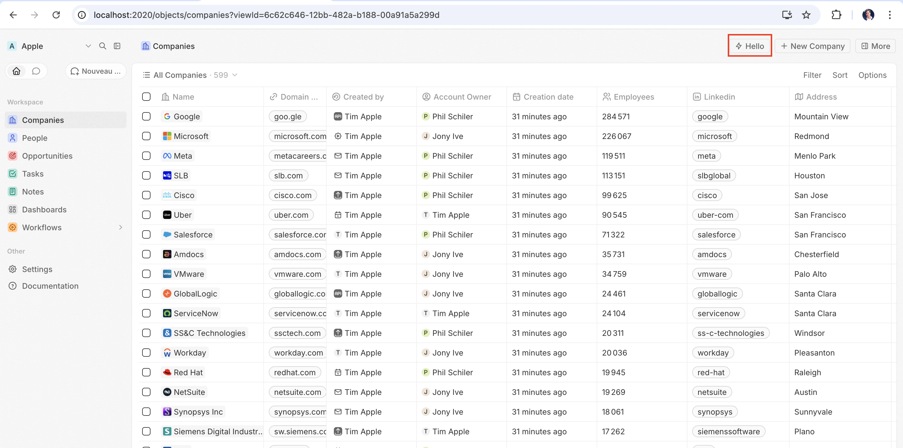
The quickest way to see a front component in action is to pair it with a [`defineCommandMenuItem`](/developers/extend/apps/layout/command-menu-items), so it appears as a quick-action button in the top-right corner of the page:
```tsx src/front-components/hello-world.tsx theme={null}
import { defineFrontComponent } from 'twenty-sdk/define';
const HelloWorld = () => {
return (
Hello from my app!
This component renders inside Twenty.
);
};
export default defineFrontComponent({
universalIdentifier: '74c526eb-cb68-4cf7-b05c-0dd8c288d948',
name: 'hello-world',
description: 'A simple front component',
component: HelloWorld,
});
```
```ts src/command-menu-items/hello-world.command-menu-item.ts theme={null}
import { defineCommandMenuItem } from 'twenty-sdk/define';
export default defineCommandMenuItem({
universalIdentifier: 'd4e5f6a7-b8c9-0123-defa-456789012345',
shortLabel: 'Hello',
label: 'Hello World',
isPinned: true,
availabilityType: 'GLOBAL',
frontComponentUniversalIdentifier: '74c526eb-cb68-4cf7-b05c-0dd8c288d948',
});
```
After syncing with `yarn twenty dev` (or running a one-shot `yarn twenty apply`), the quick action appears in the top-right corner of the page:
Click it to render the component inline.
## Configuration fields
| Field | Required | Description |
| --------------------- | -------- | ------------------------------------------------------------ |
| `universalIdentifier` | Yes | Stable unique ID for this component |
| `component` | Yes | A React component function |
| `name` | No | Display name |
| `description` | No | Description of what the component does |
| `isHeadless` | No | Set to `true` if the component has no visible UI (see below) |
## Placing a front component on a page
Beyond commands, you can embed a front component directly into a record page by adding it as a widget in a **page layout**. See [Page Layouts](/developers/extend/apps/layout/page-layouts) for details.
## Custom settings component
To replace the auto-generated variable configuration UI in your app's **Settings** tab with your own component, define it with `defineSettingsFrontComponent` instead of `defineFrontComponent`. It takes the same [configuration fields](#configuration-fields) (except `isHeadless`, which is not accepted since a settings component always renders visible UI) and additionally marks the component as the app's settings UI.
The component renders as a section **inside** the Settings tab, not as a replacement for the whole tab. Twenty's system-managed sections — auto-upgrade, App URL, and connections — always render above it and cannot be overridden by the app.
```tsx src/front-components/app-settings.tsx theme={null}
import { defineSettingsFrontComponent } from 'twenty-sdk/define';
const AppSettings = () => {
return (
My app settings
{/* render your own configuration UI here */}
);
};
export default defineSettingsFrontComponent({
universalIdentifier: 'a1b2c3d4-e5f6-7890-abcd-ef1234567890',
name: 'app-settings',
description: "Custom UI for the app's Settings tab",
component: AppSettings,
});
```
Only one settings front component is allowed per app; declaring more than one fails the build. When present, the app's **Settings** tab renders this component in place of the default variable configuration UI.
## Headless vs non-headless
Front components come in two rendering modes controlled by the `isHeadless` option:
**Non-headless (default)** — The component renders a visible UI. When triggered from the command menu it opens in the side panel. This is the default behavior when `isHeadless` is `false` or omitted.
**Headless (`isHeadless: true`)** — The component mounts invisibly in the background. It does not open the side panel. Headless components are designed for actions that execute logic and then unmount themselves — for example, running an async task, navigating to a page, or showing a confirmation modal. They pair naturally with the SDK Command components described below.
```tsx src/front-components/sync-tracker.tsx theme={null}
import { defineFrontComponent } from 'twenty-sdk/define';
import { useSelectedRecordIds, enqueueSnackbar } from 'twenty-sdk/front-component';
import { useEffect } from 'react';
const SyncTracker = () => {
const [recordId] = useSelectedRecordIds();
useEffect(() => {
enqueueSnackbar({ message: `Tracking record ${recordId}`, variant: 'info' });
}, [recordId]);
return null;
};
export default defineFrontComponent({
universalIdentifier: '...',
name: 'sync-tracker',
description: 'Tracks record views silently',
isHeadless: true,
component: SyncTracker,
});
```
Because the component returns `null`, Twenty skips rendering a container for it — no empty space appears in the layout. The component still has access to all hooks and the host communication API.
## SDK Command components
The `twenty-sdk` package provides four Command helper components designed for headless front components. Each component executes an action on mount, handles errors by showing a snackbar notification, and automatically unmounts the front component when done.
Import them from `twenty-sdk/front-component`:
* **`Command`** — Runs an async callback via the `execute` prop.
* **`CommandLink`** — Navigates to an app path. Props: `to`, `params`, `queryParams`, `options`.
* **`CommandModal`** — Opens a confirmation modal. If the user confirms, executes the `execute` callback. Props: `title`, `subtitle`, `execute`, `confirmButtonText`, `confirmButtonAccent`.
* **`CommandOpenSidePanelPage`** — Opens a side panel page. Props depend on `page` — e.g. `ViewRecord` takes `recordId` + `objectNameSingular` (plus an optional `tab` id to open the record on a specific tab), other pages take `pageTitle` + `pageIcon`.
Here is a full example of a headless front component using `Command` to run an action from the command menu:
```tsx src/front-components/run-action.tsx theme={null}
import { defineFrontComponent } from 'twenty-sdk/define';
import { Command } from 'twenty-sdk/front-component';
import { CoreApiClient } from 'twenty-client-sdk/core';
const RunAction = () => {
const execute = async () => {
const client = new CoreApiClient();
await client.mutation({
createTask: {
__args: { data: { title: 'Created by my app' } },
id: true,
},
});
};
return ;
};
export default defineFrontComponent({
universalIdentifier: 'e5f6a7b8-c9d0-1234-efab-345678901234',
name: 'run-action',
description: 'Creates a task from the command menu',
component: RunAction,
isHeadless: true,
});
```
```ts src/command-menu-items/run-action.command-menu-item.ts theme={null}
import { defineCommandMenuItem } from 'twenty-sdk/define';
export default defineCommandMenuItem({
universalIdentifier: 'f6a7b8c9-d0e1-2345-fabc-456789012345',
label: 'Run my action',
frontComponentUniversalIdentifier: 'e5f6a7b8-c9d0-1234-efab-345678901234',
});
```
And an example using `CommandModal` to ask for confirmation before executing:
```tsx src/front-components/delete-draft.tsx theme={null}
import { defineFrontComponent } from 'twenty-sdk/define';
import { CommandModal } from 'twenty-sdk/front-component';
const DeleteDraft = () => {
const execute = async () => {
// perform the deletion
};
return (
);
};
export default defineFrontComponent({
universalIdentifier: 'a7b8c9d0-e1f2-3456-abcd-567890123456',
name: 'delete-draft',
description: 'Deletes a draft with confirmation',
component: DeleteDraft,
isHeadless: true,
});
```
And an example using `CommandOpenSidePanelPage` to open the current record in the side panel on a specific tab. `tab` is a page layout tab id (default layouts use ids like `company-tab-emails` or `company-tab-timeline`; custom layouts use the tab's own id). If the id doesn't exist in the record's layout, the default tab opens instead:
```tsx src/front-components/open-company-emails.tsx theme={null}
import { defineFrontComponent } from 'twenty-sdk/define';
import {
CommandOpenSidePanelPage,
SidePanelPages,
useSelectedRecordIds,
} from 'twenty-sdk/front-component';
const OpenCompanyEmails = () => {
const selectedRecordIds = useSelectedRecordIds();
const recordId = selectedRecordIds.length === 1 ? selectedRecordIds[0] : null;
if (!recordId) {
return null;
}
return (
);
};
export default defineFrontComponent({
universalIdentifier: 'b8c9d0e1-f2a3-4567-bcde-678901234567',
name: 'open-company-emails',
description: 'Opens the current company on its Emails tab',
component: OpenCompanyEmails,
isHeadless: true,
});
```
## Calling a logic function
Front components run browser-side in a Web Worker sandboxed inside an opaque-origin iframe, while [logic functions](/developers/extend/apps/logic/logic-functions) run server-side. There is no direct in-process call between the two — instead, a front component reaches a logic function over HTTP.
A logic function declared with `httpRouteTriggerSettings` is reachable over HTTP at its route path. `RestApiClient` treats paths starting with `/s/` as app routes, resolves them to the URL your functions are served from, and authenticates them with `TWENTY_APP_ACCESS_TOKEN`.
> **On Twenty Cloud, HTTP-triggered logic functions are served on a dedicated per-workspace domain** at `https://.withtwenty.com`. For external callers, copy the exact URL from the function's **HTTP trigger** settings or the application's **Settings** tab.
A headless front component can run the call on mount via the `Command` component, then unmount automatically:
```tsx src/front-components/sync-prs.tsx theme={null}
import { RestApiClient } from 'twenty-client-sdk/rest';
import { defineFrontComponent } from 'twenty-sdk/define';
import { Command } from 'twenty-sdk/front-component';
const SyncPrs = () => {
const execute = async () => {
await new RestApiClient().post('/s/github/fetch-prs', {
owner: 'twentyhq',
repo: 'twenty',
});
};
return ;
};
export default defineFrontComponent({
universalIdentifier: '...',
name: 'sync-prs',
description: 'Triggers the fetch-prs logic function',
isHeadless: true,
component: SyncPrs,
});
```
The path passed to `RestApiClient` is the logic function's `httpRouteTriggerSettings.path`, prefixed with `/s`. Keep `isAuthRequired: true`; the `TWENTY_APP_ACCESS_TOKEN` Twenty mints for your component authenticates the request:
```ts src/logic-functions/fetch-prs.logic-function.ts theme={null}
import { defineLogicFunction } from 'twenty-sdk/define';
import type { RoutePayload } from 'twenty-sdk/logic-function';
const handler = async (event: RoutePayload) => {
const { owner, repo } = (event.body ?? {}) as { owner: string; repo: string };
// ...fetch from GitHub and persist records...
return { ok: true };
};
export default defineLogicFunction({
universalIdentifier: '...',
name: 'fetch-prs',
handler,
httpRouteTriggerSettings: {
path: '/github/fetch-prs',
httpMethod: 'POST',
isAuthRequired: true,
},
});
```
`TWENTY_APP_ACCESS_TOKEN` is injected automatically — see [Application variables](#application-variables). Because secret application variables are never exposed to front components, keep API keys and other sensitive logic in the logic function, not in the front component.
### Calling the Twenty REST API
To call app HTTP routes or read and write Twenty records from a front component, use `RestApiClient` from `twenty-client-sdk/rest`. It sends `/s/...` paths to your workspace's functions base URL and every other path, including `/rest/...`, to `TWENTY_API_URL`.
| Method | Description |
| --------------------------------- | --------------------------------------------------------------------- |
| `get(path, options?)` | Sends a `GET` request |
| `post(path, body?, options?)` | Sends a `POST` request |
| `put(path, body?, options?)` | Sends a `PUT` request |
| `patch(path, body?, options?)` | Sends a `PATCH` request |
| `delete(path, options?)` | Sends a `DELETE` request |
| `request(method, path, options?)` | Generic request with any HTTP method |
| `resolveUrl(path, options?)` | Resolves a path to its full URL without sending a request (for links) |
`options` accepts `headers`, `query` (a record of query-string params; nullish values are skipped), and an `AbortSignal` via `signal`. A non-`FormData` object `body` is JSON-serialized automatically. On a `401`, the client refreshes the access token once through the host and retries the request.
The base URL and token are resolved from the environment by default. Pass overrides to the constructor when needed — for example in tests:
```ts theme={null}
const client = new RestApiClient({
baseUrl: 'https://myworkspace.twenty.com',
token: 'my-token',
});
```
Failed requests throw a `RestApiClientError` exposing `status`, `statusText`, `url`, and the parsed `body`:
```tsx theme={null}
import { RestApiClient, RestApiClientError } from 'twenty-client-sdk/rest';
const client = new RestApiClient();
try {
const people = await client.get('/rest/people', {
query: { limit: 10 },
});
} catch (error) {
if (error instanceof RestApiClientError) {
console.error(error.status, error.body);
}
}
```
## Accessing runtime context
Inside your component, use SDK hooks to access the current user, record, and component instance:
```tsx src/front-components/record-info.tsx theme={null}
import { defineFrontComponent } from 'twenty-sdk/define';
import {
useUserId,
useSelectedRecordIds,
useFrontComponentId,
} from 'twenty-sdk/front-component';
const RecordInfo = () => {
const userId = useUserId();
const [recordId] = useSelectedRecordIds();
const componentId = useFrontComponentId();
return (
User: {userId}
Record: {recordId ?? 'No record context'}
Component: {componentId}
);
};
export default defineFrontComponent({
universalIdentifier: 'b2c3d4e5-f6a7-8901-bcde-f23456789012',
name: 'record-info',
component: RecordInfo,
});
```
Available hooks:
| Hook | Returns | Description |
| --------------------------------------------- | --------------------- | ---------------------------------------------------------------- |
| `useUserId()` | `string` or `null` | The current user's ID |
| `useSelectedRecordIds()` | `string[]` | All selected record IDs (empty array if none selected) |
| `useRecordId()` | `string` or `null` | **Deprecated.** Use `useSelectedRecordIds()` instead |
| `useFrontComponentId()` | `string` | This component instance's ID |
| `useColorScheme()` | `'light'` or `'dark'` | The host UI's active color scheme (`System` is already resolved) |
| `useFrontComponentExecutionContext(selector)` | varies | Access the full execution context with a selector function |
## Application variables
Application variables defined in [`defineApplication()`](/developers/extend/apps/config/application) with `isSecret: false` are available inside front components via the `getApplicationVariable` utility:
```tsx src/front-components/greeting.tsx theme={null}
import { defineFrontComponent } from 'twenty-sdk/define';
import { getApplicationVariable } from 'twenty-sdk/front-component';
const Greeting = () => {
const recipientName = getApplicationVariable('DEFAULT_RECIPIENT_NAME') ?? 'World';
return
Hello, {recipientName}!
;
};
export default defineFrontComponent({
universalIdentifier: '...',
name: 'greeting',
component: Greeting,
});
```
Secret variables (`isSecret: true`) are **not** exposed to front components. They are only available in [logic functions](/developers/extend/apps/logic/logic-functions), which run server-side. This prevents sensitive values like API keys from being sent to the browser.
`getApplicationVariable` always returns a **string** (or `undefined`), regardless of the variable's declared `type`. The string is serialized consistently by type (booleans as `"true"` / `"false"`, numbers as decimal strings, arrays / objects as JSON), the same format used for logic-function `process.env` — parse it yourself (`Number(...)`, `JSON.parse(...)`, `=== 'true'`). See [Variable types](/developers/extend/apps/config/application#variable-types).
The following system variables are always available via `process.env`:
| Variable | Description |
| ------------------------- | ------------------------------------------- |
| `TWENTY_API_URL` | Base URL of the Twenty core API |
| `TWENTY_APP_ACCESS_TOKEN` | Short-lived token scoped to your app's role |
### `TWENTY_FUNCTIONS_URL`
Twenty also injects `TWENTY_FUNCTIONS_URL` into front components and logic functions: the base URL your app's HTTP-triggered logic functions are served from.
It exists because that URL is not always the Twenty server itself. On Twenty Cloud, app routes are served on a dedicated per-workspace domain (`https://.withtwenty.com`, or the application's primary public domain when one is configured) so that app-authored responses run on an isolated origin rather than on the Twenty app origin. Self-hosted and local instances serve app routes under the `/s` prefix on the server itself and may not set the variable at all. Since the base URL varies per workspace and per instance, your code cannot hard-code it — the server injects the right value at runtime.
You rarely need to read it directly. Call your routes through `RestApiClient` with a `/s/`-prefixed path and the client resolves the URL for you: it strips the `/s` prefix and targets `TWENTY_FUNCTIONS_URL`, falling back to `/s` when the variable is not set. Use `resolveUrl('/s/')` to get the absolute URL without sending a request, e.g. for a link. Read the variable directly only when building a URL by hand:
```ts theme={null}
const routeUrl = `${process.env.TWENTY_FUNCTIONS_URL || `${process.env.TWENTY_API_URL}/s`}/documents/generate`;
```
## Host communication API
Front components can trigger navigation, modals, and notifications using functions from `twenty-sdk`:
| Function | Description |
| ----------------------------------------------- | ----------------------------- |
| `navigate(to, params?, queryParams?, options?)` | Navigate to a page in the app |
| `openSidePanelPage(params)` | Open a side panel |
| `closeSidePanel()` | Close the side panel |
| `openCommandConfirmationModal(params)` | Show a confirmation dialog |
| `enqueueSnackbar(params)` | Show a toast notification |
| `unmountFrontComponent()` | Unmount the component |
| `updateProgress(progress)` | Update a progress indicator |
Here is an example that uses the host API to show a snackbar and close the side panel after an action completes:
```tsx src/front-components/archive-record.tsx theme={null}
import { defineFrontComponent } from 'twenty-sdk/define';
import { enqueueSnackbar, closeSidePanel, useSelectedRecordIds } from 'twenty-sdk/front-component';
import { CoreApiClient } from 'twenty-client-sdk/core';
const ArchiveRecord = () => {
const [recordId] = useSelectedRecordIds();
const handleArchive = async () => {
const client = new CoreApiClient();
await client.mutation({
updateTask: {
__args: { id: recordId, data: { status: 'ARCHIVED' } },
id: true,
},
});
await enqueueSnackbar({
message: 'Record archived',
variant: 'success',
});
await closeSidePanel();
};
return (
Archive this record?
);
};
export default defineFrontComponent({
universalIdentifier: 'c9d0e1f2-a3b4-5678-cdef-789012345678',
name: 'archive-record',
description: 'Archives the current record',
component: ArchiveRecord,
});
```
### Working with multiple records
Use `useSelectedRecordIds()` to handle multiple selected records. This is useful for bulk operations:
```tsx src/front-components/bulk-export.tsx theme={null}
import { defineFrontComponent } from 'twenty-sdk/define';
import { useSelectedRecordIds } from 'twenty-sdk/front-component';
import { enqueueSnackbar, closeSidePanel } from 'twenty-sdk/front-component';
import { CoreApiClient } from 'twenty-client-sdk/core';
const BulkExport = () => {
const selectedRecordIds = useSelectedRecordIds();
const handleExport = async () => {
const client = new CoreApiClient();
for (const recordId of selectedRecordIds) {
await client.mutation({
updateTask: {
__args: { id: recordId, data: { exported: true } },
id: true,
},
});
}
await enqueueSnackbar({
message: `Exported ${selectedRecordIds.length} records`,
variant: 'success',
});
await closeSidePanel();
};
return (
);
};
export default defineFrontComponent({
universalIdentifier: 'd0e1f2a3-b4c5-6789-defa-012345678901',
name: 'bulk-export',
description: 'Export selected records',
component: BulkExport,
});
```
Surface it with a [command menu item](/developers/extend/apps/layout/command-menu-items) restricted to record selections:
```ts src/command-menu-items/bulk-export.command-menu-item.ts theme={null}
import { defineCommandMenuItem } from 'twenty-sdk/define';
export default defineCommandMenuItem({
universalIdentifier: 'd0e1f2a3-b4c5-6789-defa-012345678902',
label: 'Bulk Export',
availabilityType: 'RECORD_SELECTION',
frontComponentUniversalIdentifier: 'd0e1f2a3-b4c5-6789-defa-012345678901',
});
```
## Public assets
Front components can access files from the app's `public/` directory using `getPublicAssetUrl`:
```tsx theme={null}
import { defineFrontComponent } from 'twenty-sdk/define';
import { getPublicAssetUrl } from 'twenty-sdk/utils';
const Logo = () => ;
export default defineFrontComponent({
universalIdentifier: '...',
name: 'logo',
component: Logo,
});
```
See the [public assets section](/developers/extend/apps/config/public-assets) for details.
## Styling
Front components support multiple styling approaches. You can use:
* **Inline styles** — `style={{ color: 'red' }}`
* **Twenty UI components** — Twenty's own component library; see [Using Twenty UI components](#using-twenty-ui-components) below
* **Emotion** — CSS-in-JS with `@emotion/react`
* **Styled-components** — `styled.div` patterns
* **Tailwind CSS** — utility classes
* **Any CSS-in-JS library** compatible with React
## Using Twenty UI components
Twenty ships its component library as the [`twenty-ui`](https://www.npmjs.com/package/twenty-ui/v/1.0.0-alpha.1) package. Front components can use it for buttons, tags, status pills, chips, avatars, icons, typography, and theme tokens that automatically match the workspace's light and dark theme.
### Installation
Add the package to your app, pinned to the version your Twenty instance ships:
```bash theme={null}
yarn add twenty-ui@1.0.0-alpha.1
```
`twenty-ui` is bundled into your front component at build time, so it only needs to be a dependency of your app — there is nothing to configure at runtime.
### Importing components
Import from the matching subpath rather than the package root, so only the components you use end up in your bundle:
| Subpath | What it exports |
| --------------------------- | -------------------------------------------------- |
| `twenty-ui/input` | `Button` and form inputs |
| `twenty-ui/data-display` | `Tag`, `Status`, `Chip`, `Avatar`, and more |
| `twenty-ui/feedback` | `Callout`, `Banner`, `Info`, and more |
| `twenty-ui/typography` | `H1Title`, `H2Title`, `H3Title`, `Label`, and more |
| `twenty-ui/icon` | `Icon*` components (e.g. `IconCheck`) |
| `twenty-ui/theme-constants` | `ThemeProvider`, `themeCssVariables` |
```tsx theme={null}
import { defineFrontComponent } from 'twenty-sdk/define';
import { Status, Tag } from 'twenty-ui/data-display';
import { Button } from 'twenty-ui/input';
const StyledWidget = () => {
return (
);
};
export default defineFrontComponent({
universalIdentifier: 'e5f6a7b8-c9d0-1234-efab-567890123456',
name: 'styled-widget',
component: StyledWidget,
});
```
### Icons
Import individual icons from `twenty-ui/icon`:
```tsx theme={null}
import { IconBox, IconCheck } from 'twenty-ui/icon';
```
Each named icon is tree-shaken, so importing a handful adds little to your bundle. Avoid `IconsProvider`, `useIcons`, and `iconsState` — they pull in the full Tabler icon set (several MB).
### Theming and theme tokens
Twenty UI components automatically match the workspace's light and dark theme — the renderer applies the active color scheme on the host, and the components resolve their colors against it.
To use the same design tokens in your own inline styles, call the `useTheme()` hook. It returns Twenty's theme tokens (spacing, colors, radii, fonts) wired to the active theme, with no `ThemeProvider` setup needed in your component:
```tsx theme={null}
import { useTheme } from 'twenty-ui/theme-constants';
const Card = () => {
const theme = useTheme();
return (
Themed card
);
};
```
Because `useTheme()` is a hook, you read tokens inside the component body, so the values always reflect the live theme. The same token map is also exported as the `themeCssVariables` constant, but prefer `useTheme()` in front components — a module-level constant that dereferences `themeCssVariables` can be undefined while the app manifest is extracted.
To branch on the active scheme explicitly, read it with `useColorScheme()` from `twenty-sdk/front-component`, which returns `'light'` or `'dark'`.
## Current limitations
Front components are under active development. Rendering, styling and handling events works well. Anything that reaches *past* rendering (measuring an element, calling a DOM method on a ref, portaling outside your tree, touching browser storage) is missing or incomplete today, and most of it fails silently: no exception, and no TypeScript error either, since the scaffold is typed against the full browser DOM.
If one of these blocks you, [open an issue](https://github.com/twentyhq/twenty/issues/new/choose) so it gets prioritized.
### Layout and measurement
Nothing can measure itself yet.
| API | What happens |
| ------------------------------------------------------------- | ---------------------------------------------------------------------------------- |
| `getBoundingClientRect()`, `getClientRects()` | Throws |
| `offsetWidth`, `clientWidth`, `scrollWidth`, `offsetTop`, ... | Silently `undefined`, so `width ?? 0` yields `0` and `width > 600` is always false |
| `ResizeObserver`, `IntersectionObserver` | `ReferenceError` (`typeof` guards do work) |
| `window.matchMedia()`, `window.getComputedStyle()` | Throws |
| `window.innerWidth`, `innerHeight`, `devicePixelRatio` | Silently `undefined` |
| `new MutationObserver(fn)` | Constructs, then `.observe()` throws |
So recharts `ResponsiveContainer`, Floating UI / Popper, list virtualization and drag-to-resize do not work yet. Do layout in CSS instead: your stylesheet reaches the real page, so flexbox, grid, `aspect-ratio`, `clamp()` and `@container` all behave normally.
`requestAnimationFrame`, `fetch`, `setTimeout` and `queueMicrotask` work without the `window.` prefix. Only `window.requestAnimationFrame(...)` and friends throw.
### DOM access
A `ref` gives you a sandbox element, not an `HTMLElement`.
| What you write | What happens | Use instead |
| ----------------------------------------------------------------------------------------------------------- | ---------------------------------------------------- | ----------------------------------------------------------------------------------------- |
| `ref.current.focus()`, `.click()`, `.select()`, `.setSelectionRange()`, `.scrollIntoView()`, `video.play()` | Throws | Controlled components; read values from `event.target` |
| `element.classList.add(...)` | Throws (`classList` is `undefined`) | Build the `className` string yourself |
| `document.getElementById()`, `getElementsByClassName()`, `createTreeWalker()` | Throws | `querySelector()` / `querySelectorAll()`, which work |
| `document.activeElement` | Always `undefined` | Track focus with `onFocus` / `onBlur` |
| `
}) ;
export default defineFrontComponent({
universalIdentifier: '...',
name: 'logo',
component: Logo,
});
```
See the [public assets section](/developers/extend/apps/config/public-assets) for details.
## Styling
Front components support multiple styling approaches. You can use:
* **Inline styles** — `style={{ color: 'red' }}`
* **Twenty UI components** — Twenty's own component library; see [Using Twenty UI components](#using-twenty-ui-components) below
* **Emotion** — CSS-in-JS with `@emotion/react`
* **Styled-components** — `styled.div` patterns
* **Tailwind CSS** — utility classes
* **Any CSS-in-JS library** compatible with React
## Using Twenty UI components
Twenty ships its component library as the [`twenty-ui`](https://www.npmjs.com/package/twenty-ui/v/1.0.0-alpha.1) package. Front components can use it for buttons, tags, status pills, chips, avatars, icons, typography, and theme tokens that automatically match the workspace's light and dark theme.
### Installation
Add the package to your app, pinned to the version your Twenty instance ships:
```bash theme={null}
yarn add twenty-ui@1.0.0-alpha.1
```
`twenty-ui` is bundled into your front component at build time, so it only needs to be a dependency of your app — there is nothing to configure at runtime.
### Importing components
Import from the matching subpath rather than the package root, so only the components you use end up in your bundle:
| Subpath | What it exports |
| --------------------------- | -------------------------------------------------- |
| `twenty-ui/input` | `Button` and form inputs |
| `twenty-ui/data-display` | `Tag`, `Status`, `Chip`, `Avatar`, and more |
| `twenty-ui/feedback` | `Callout`, `Banner`, `Info`, and more |
| `twenty-ui/typography` | `H1Title`, `H2Title`, `H3Title`, `Label`, and more |
| `twenty-ui/icon` | `Icon*` components (e.g. `IconCheck`) |
| `twenty-ui/theme-constants` | `ThemeProvider`, `themeCssVariables` |
```tsx theme={null}
import { defineFrontComponent } from 'twenty-sdk/define';
import { Status, Tag } from 'twenty-ui/data-display';
import { Button } from 'twenty-ui/input';
const StyledWidget = () => {
return (
;
export default defineFrontComponent({
universalIdentifier: '...',
name: 'logo',
component: Logo,
});
```
See the [public assets section](/developers/extend/apps/config/public-assets) for details.
## Styling
Front components support multiple styling approaches. You can use:
* **Inline styles** — `style={{ color: 'red' }}`
* **Twenty UI components** — Twenty's own component library; see [Using Twenty UI components](#using-twenty-ui-components) below
* **Emotion** — CSS-in-JS with `@emotion/react`
* **Styled-components** — `styled.div` patterns
* **Tailwind CSS** — utility classes
* **Any CSS-in-JS library** compatible with React
## Using Twenty UI components
Twenty ships its component library as the [`twenty-ui`](https://www.npmjs.com/package/twenty-ui/v/1.0.0-alpha.1) package. Front components can use it for buttons, tags, status pills, chips, avatars, icons, typography, and theme tokens that automatically match the workspace's light and dark theme.
### Installation
Add the package to your app, pinned to the version your Twenty instance ships:
```bash theme={null}
yarn add twenty-ui@1.0.0-alpha.1
```
`twenty-ui` is bundled into your front component at build time, so it only needs to be a dependency of your app — there is nothing to configure at runtime.
### Importing components
Import from the matching subpath rather than the package root, so only the components you use end up in your bundle:
| Subpath | What it exports |
| --------------------------- | -------------------------------------------------- |
| `twenty-ui/input` | `Button` and form inputs |
| `twenty-ui/data-display` | `Tag`, `Status`, `Chip`, `Avatar`, and more |
| `twenty-ui/feedback` | `Callout`, `Banner`, `Info`, and more |
| `twenty-ui/typography` | `H1Title`, `H2Title`, `H3Title`, `Label`, and more |
| `twenty-ui/icon` | `Icon*` components (e.g. `IconCheck`) |
| `twenty-ui/theme-constants` | `ThemeProvider`, `themeCssVariables` |
```tsx theme={null}
import { defineFrontComponent } from 'twenty-sdk/define';
import { Status, Tag } from 'twenty-ui/data-display';
import { Button } from 'twenty-ui/input';
const StyledWidget = () => {
return (